
On January 27th, 5 PM the international poster exhibition “PoszTerra” of the Hungarian Academy of Arts opens in Energy and Technology Museum. The exhibition was arranged for the 30th anniversary of the founding of the Visegrad Group (V4) and offers to see a selection of works of the most outstanding poster artists of the four countries of Central Europe.
The V4 is a cultural and political alliance of Poland, Hungary, Czech Republic and Slovakia. The Group traces its origins to the summit meetings in Hungarian town of Visegrad on February 15th, 1991.
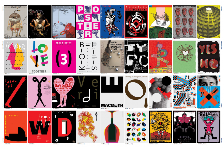
The traveling exhibition first opened in February, 2021, in Budapest. Since then it has been exhibited in Krakow, Prague, Stuttgart, Sarajevo, Istanbul, Copenhagen, Oslo, Stockholm, Helsinki, Riga and now in Vilnius. The V4 are represented by 12 graphic artists and their students. The curator of the exhibition is Krzysztof Ducki.
The exhibition is organized in cooperation with the Embassy of Hungary in Vilnius. The posters are displayed in the Industry Exposition (second floor) and in Steam Condenser Hall (lower floor of the museum).
The exhibition will be on display from January 27th to March 28th.
Entry to the exhibition opening is free.
A National Certificate is required to attend indoor events.
—
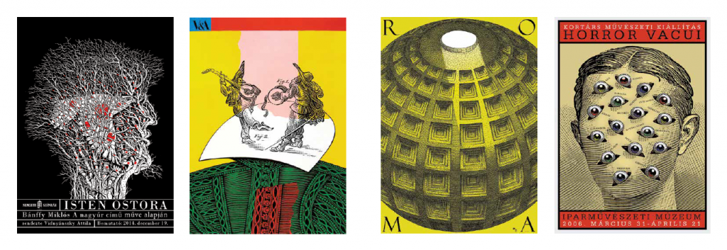
István Orosz. Four paragraphs about the poster, or the secret of the bedding holders
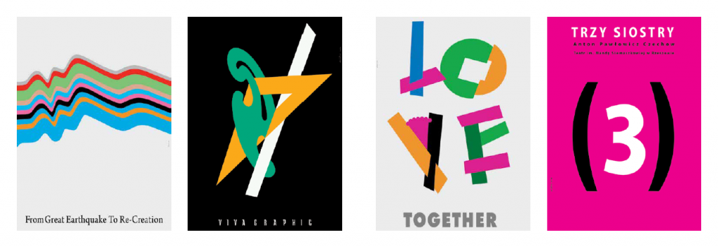
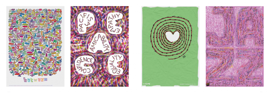
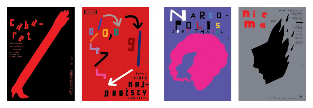
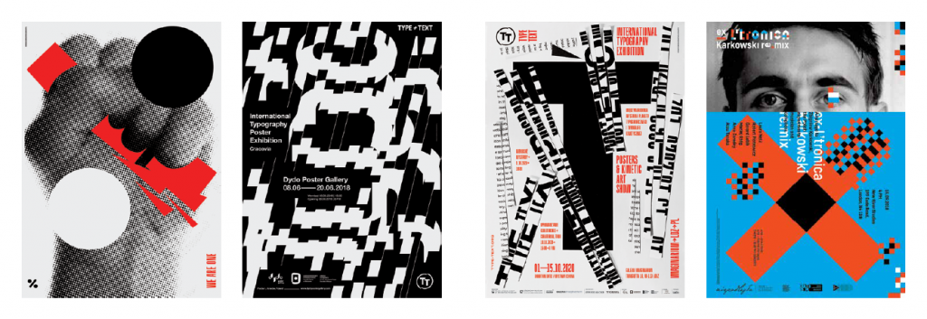
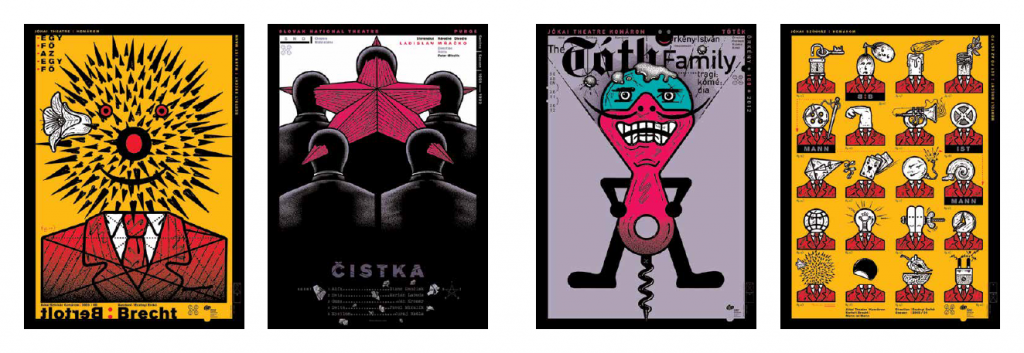
V4. Four countries, four languages, twelve graphic artists. There were times when they used dictionaries for each other’s languages, times when they tried to communicate in Russian, or English, but soon they have recognized, that they have a mutual language. The poster. What can only be explained by a thousand words, can be told by a single picture. A stated dot, a starting line, an incomplete drawing on a napkin, a mask or on the back of a beer mat… sketches, drafts, “visual communications”. We understood each other out of half words.
V4. Great powers of poster. The Brno Biennale, the Trnava Triennale, the Budapest Posterfest, and of course the most patinated, the Warsaw Poster Biennale. There was a poster exhibition far far away, where Polish became the official language – besides the obligatory English – saying that is the mother tongue of poster. Coincidentally, a Polish man was also elected president of the Hungarian Poster Society – who is also a Hungarian artist (he says so), Krzysztof Ducki. (A more unanimous vote cannot be recalled by the author of the preface.)
V4. World trend: the poster is disappearing, at least at public places. They retreat into the walls of galleries, museums. However, in the Czech Republic, Slovakia, Poland, and Hungary, they still appear on advertising columns. Although it is said that there are now fresher and much cheaper varieties of communication, they have somehow attached to the urban street scene. Maybe to the hearts of people passing by, too?
V4. If a hundred poster designers could be chosen, a hundred would still be left out. Today’s decisor – the curator – was Krzysztof Ducki. I write today because if he had chosen yesterday or tomorrow, he would surely have called others or knocked on others, as he has an entrance into the studio and even the bedroom of almost every creator of the V rectangle. Do not collide, there is no better place to store posters than bedding holders. The 70×100 prints can be laid out nicely, can be easily flipped through and can be stored for a long time. And of course, you can find them quickly when it comes to a new exhibition. For example, this here now, at the Vigadó in Budapest.
ABOUT ARTISTS
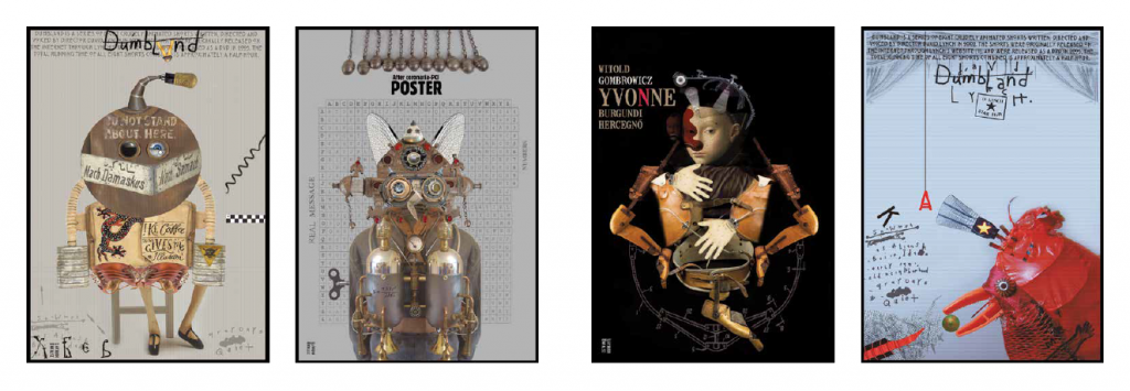
István Horkay
Also noted as a painter, applied graphic artist, and filmmaker, Horkay mastered his mature and confident technical knowledge in a pluralistic artistic environment pregnant with a variety of styles and trends. He began his studies at the Royal Danish Academy of Fine Arts, continued at the Krakow College of Fine Arts, and then completed his master’s degree at the Budapest College of Fine Arts. The message of his surreal posters, which move the viewer’s imagination, is carried by the unstable symmetry of compositional elements forced into strict equilibrium situations, but also playfully tilted out of them. It follows from the picturesque inspiration of Horkay’s works that typography never becomes an integral part of pictorial representation. The texts function as a reference field, giving the key to interpreting what is seen. The characters in the posters are typically Central European, Kafkaesque figures who are the heroes of the fictional mythology of our subconscious world. The metaphorical language of the posters is given by the prolific interplay of seemingly contradictory, yet brought into symbiosis, or assembled like elements of a collage.
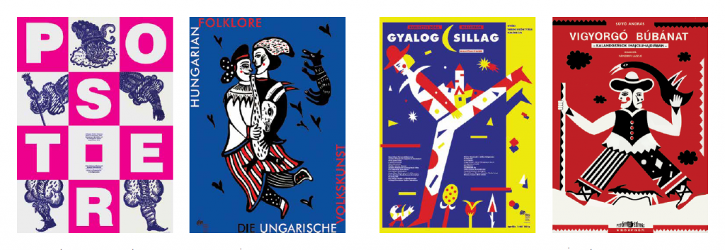
Dóra Keresztes
To the artist, who has acquired the expertise necessary for design graphics, printing and illustration graphics at the Budapest College of Applied Arts, the poster means a medium in which she can utilize her knowledge of animated film, children’s book illustration and typography autonomously. An essential element of her work is to evoke the traditions of Hungarian folk art and popular culture and the world of colour and form of the 14th century Italian mural painting and to sound the poster in its decorative, yet simplified language, with modern tools. Her focus is on the boundary between abstraction and figurativeness, and as a result, she explores the transformational possibilities of compositional elements and the metamorphosis of the depicted motifs in her works. Her works are characterized by tasteful humorous storytelling, anecdotal tone and symbolically used pure colours. On her posters, the letters appear as equal abstract elements next to the pictorial content, mostly painted with tempera or shown in linocut.
Karel Míšek
The origin of his visual experiments is the approach he learned from František Muzyka at the Academy of Arts in Prague, which aimed at a straightforward view of different media, striving for the dynamic use of interaction of photography, graphics, and painting. His studies with Henryk Tomaszewski, the father of the Polish poster school in Warsaw, became decisive in his search for an individual style based on expressive formal language. He became a significant teacher at the Department of Design Graphics of the Jan Evangelista Purkyně University in Ústí nad Labem. Mišek’s universal aesthetic and pedagogical program of visual communication, exploring national and universal symbols of cultural identity, gave the idea to the Prague Virtual Biennale he co-initiated in 2007 with others. His commitment to the transregional nature of poster art is due to his workshops around the world and, at the invitation of Lech Majewski, his active participation in the organization of the Warsaw Poster Biennale. The subversive, dramatic nature of his posters is given by the lines squeezed between the powerful contours, which often gain equal function to letters as typographic signifiers. The drawing-kind, refined decadence, and high degree of decorativeness of his works can also be considered as a sign reference to the Art Nouveau posters of the celebrated predecessor, Alfons Mucha.
Jan Rajlich Jr.
He originally graduated as an architect and worked as an interior designer for the Brno State Commercial Planning Company. His father was a renowned poster designer, also the initiator of the Brno International Design Graphic Biennale and then its president for thirty years. His son, Jan Rajlich, also began his career as a graphic artist and teacher and is currently a professor at the Department of Design at the Technical University of Brno. His experiments with technical drawings, various reproduction techniques, and oil painting have left their mark on the style of his handcrafted posters with an impressive masterful routine. The central motif of graphic-based posters based on drawing, which gives space to the artist’s free sketching, is usually an eye-catching awkward form that can often be traced back to automatic text favoured by surrealists who inadvertently turn spontaneous and uncontrolled processes into aesthetic categories. Rajlich’s posters spread out as a visual texture that fuses the image with the letter in front of the viewer-reader, waiting for someone to unravel the meaning of the interlocking layers built upon the dialogue between the enigmatic and the concrete.
Lech Majewski
Majewski, who graduated from the Warsaw Academy of Arts and started from the studio of Henryk Tomaszewski, a leading figure in the Polish and even European poster scene, is considered one of the veterans of the profession. He is currently chairing the International Poster Biennale as its president. In addition to his work as a book designer and illustrator, his achievements in renewing the Polish poster genre over the past forty years have proved particularly decisive for generations of students, and more than once for his colleagues working in Central Europe. In his works, pictorial elements form an indivisible unity with typography. They make the viewer become part of a visual game in which the letters must be viewed or read as images, the images as letters. Majewski likes the fragmented inscriptions that cover the composition as a mesh-like structure and the large, monoblock forms that contrast with them. His posters return to the fictional characters associated with the theme they want to process, which reappear again and again as characters of a personal mythology. In this way, his works become easily identifiable brands, image elements, and carriers of meaning that are essential symbols. The artist’s posters are characterized by grotesque language, montage-like image construction rooted in pop-art, which seeks to overemphasize a visual element, and the characteristic harsh world of colours.
Agnieszka Ziemiszewska
She graduated from the Academy of Fine Arts in Łódź and Warsaw. The artist, who is a lecturer at the Polish–Japanese Academy of Informatics as well as the Academy of Fine Arts in Warsaw, mostly makes experimental posters and sees the medium as a universal, autonomous and self-governing means of artistic expression. An intellectual creator who thinks in the language of metaphors and translates her experiences into messages that can be expressed with the image, can be conveyed to as many people as possible as a means of social publicity. The crisp freshness, the youthful vision and the conscious outsider attitude rejecting the mainstream characterize the highly disturbing and impulsive aesthetics of Ziemiszewska’s posters, which result from the optical deconstruction of letters and pictorial montages. Despite all its inclusions, her suggestive compositions, organized from small details that enclose the image field as a texture, can also be seen as a kind of reflection of our global and optimistic world. The artist sees the poster not only as a tool of communication, but also of intervention and invention – it follows that the medium also plays a role in public art performances based on audience participation. To her, the most important goal and message in teaching is working together with students and teachers. She has given lectures and workshops in several countries of the world.
Vladislav Rostoka
Rostoka, who studied painting and graphics at the Academy of Fine Arts and Design in Bratislava and then taught there for a few years. Rostoka became an active member of the international poster art scene as one of the most important typographers in the region. His textbooks and publications play a key role in the recognition of contemporary poster art, the discovery, and the selfless promotion of his colleagues’ works. In his works, he combines the intimate character and instinct of freehand drawing with the systematic, mathematically describable formulas of computer graphic design. It is from this duality that seemingly mismatched elements meet on their posters. He generally uses pictorial topoi which combine reality with fantasy as the central motif of his creations. However, the somewhat eccentric nature of the “magical realism” that can be read from them is sobered up by a rigorous and measured typography designed in an engineering-technical way. In addition to French surrealism and art-deco, his works of emblematic power, formulated with analytical interest, were primarily influenced by constructivist and concrete aspirations from the fine art traditions of Central and Eastern Europe. One of the aphorisms of his art characteristic for his conceptual pathfinding is that the poster designer is supposed to say a lot with only a few tools.
More about all the artists participating in the exhibition – in the exhibition catalog.